
DESIGN
BRANDING + PRINT
NORTH BREW COFFEE
A few years ago, a fellow college student had asked me to help him out with a logo for his first start-up company. Since then, North Brew Coffee has been booming with business. They’re emptying the shelves at local coffee shops! I’ve worked on a variety of projects for North Brew, including the identity, packaging, and the Cold Brew series.
The logo cleverly uses the mountains to form the N and the negative space to form the B. Further, the spiky angles and straight edges emulate sharpness, a core element of the North Brew brand.


North Brew packaging
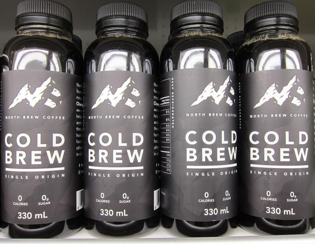
Cold Brew line-up on store shelves
BRANDING + PRINT
CNA CONFERENCE 2020
Every year, the Canadian Nuclear Association holds the premier event for the nuclear industry in Canada. This project required a huge suite of branded collateral, including program booklets, app graphics, social media assets, video backgrounds, conference programs, hotel key cards, and large format signage.
The theme for 2020 was Nuclear Now: Achieving our Clean Energy Future. To achieve this, the foliage elements from the CNA2020 logo are placed within organically shaped waves that use a range of colours from the CNA brand. The goal of this massive project was to strategically implement branded elements to each piece; creating a happy little family of consistently treated collateral.
The work produced in this project contributed to raising awareness of the positive impact nuclear energy has on the future.
This project was made while working at Xquisit Communications.


Signage

Sponsorship package

Pocket program

A proud Imran being a goof
BRANDING + PRINT
JASK SALON
The new Jask logo was handed to me and my job was to build the new Jask brand. This included a brochure package, outdoor signage, business cards, and appointment cards. To create a sense of elegance, I went with a limited, muted colour palette. Large amounts of white space is utilized wherever possible. The custom die-cut on the brochure uses the angle from the logo to create a home for a business card. The custom UV emulates the flowing liquid theme of the inside cards, as well as names on the business cards. Cumulatively, these decisions all support the theme of elegance and class.
This project was made while working at Xquisit Communications.
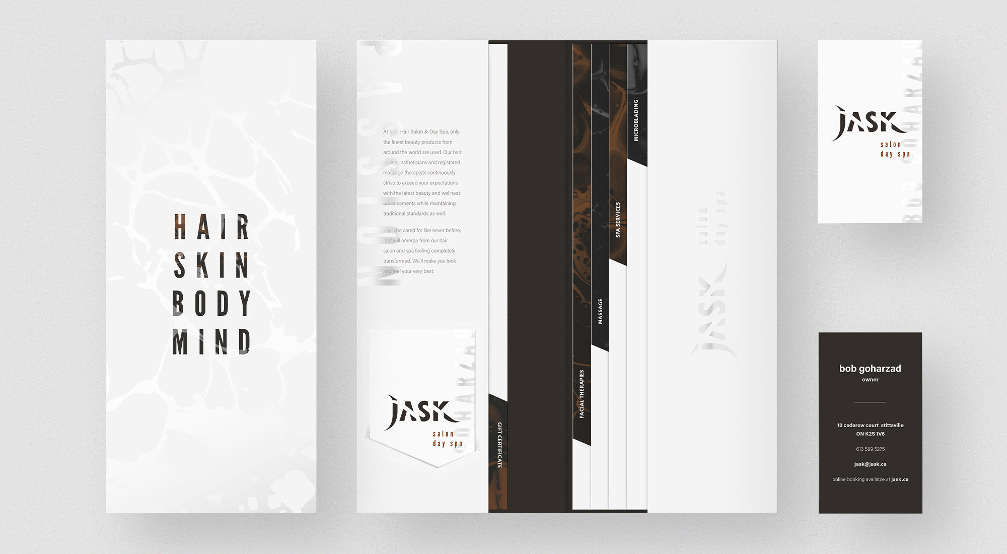
Brochure package
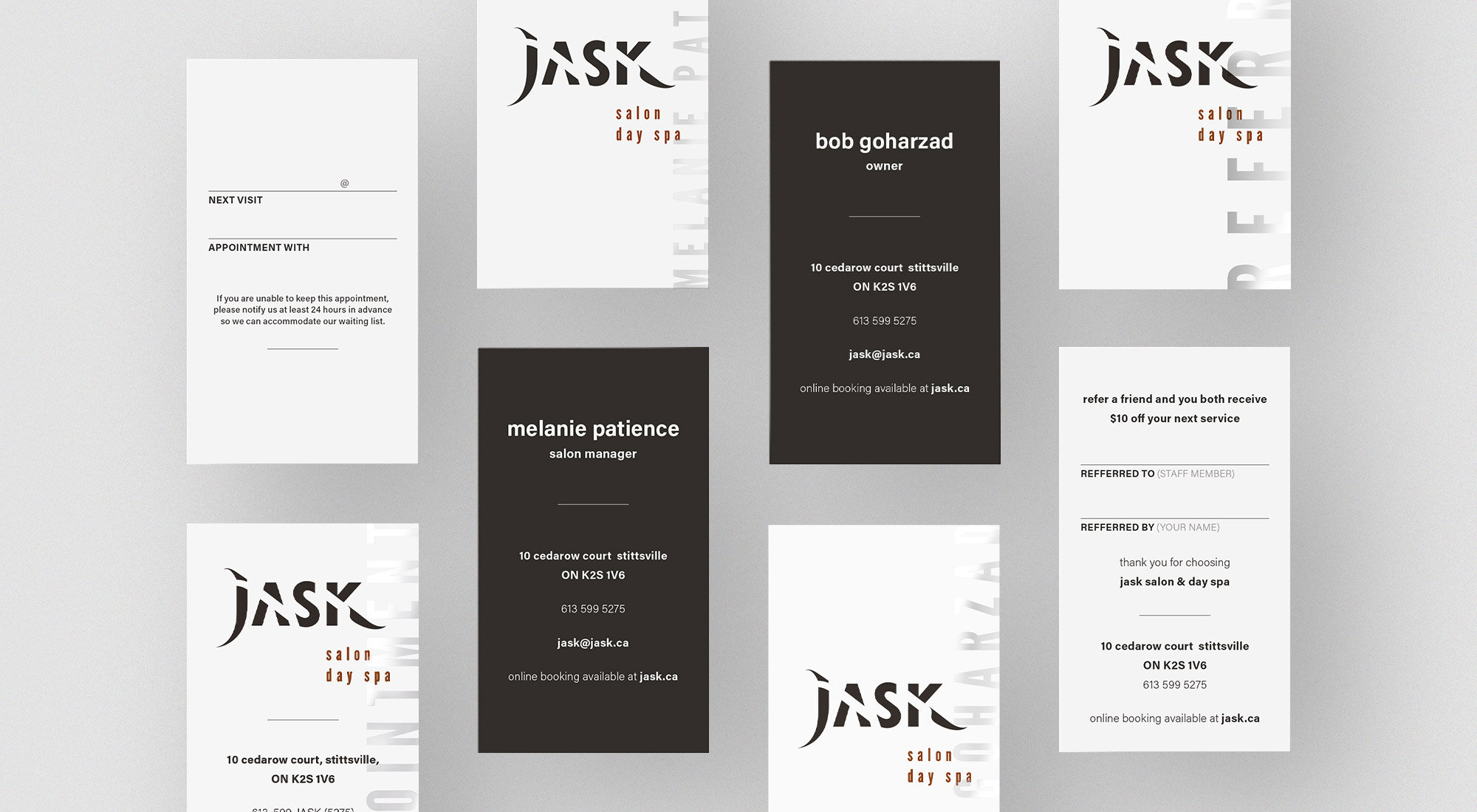
Cards
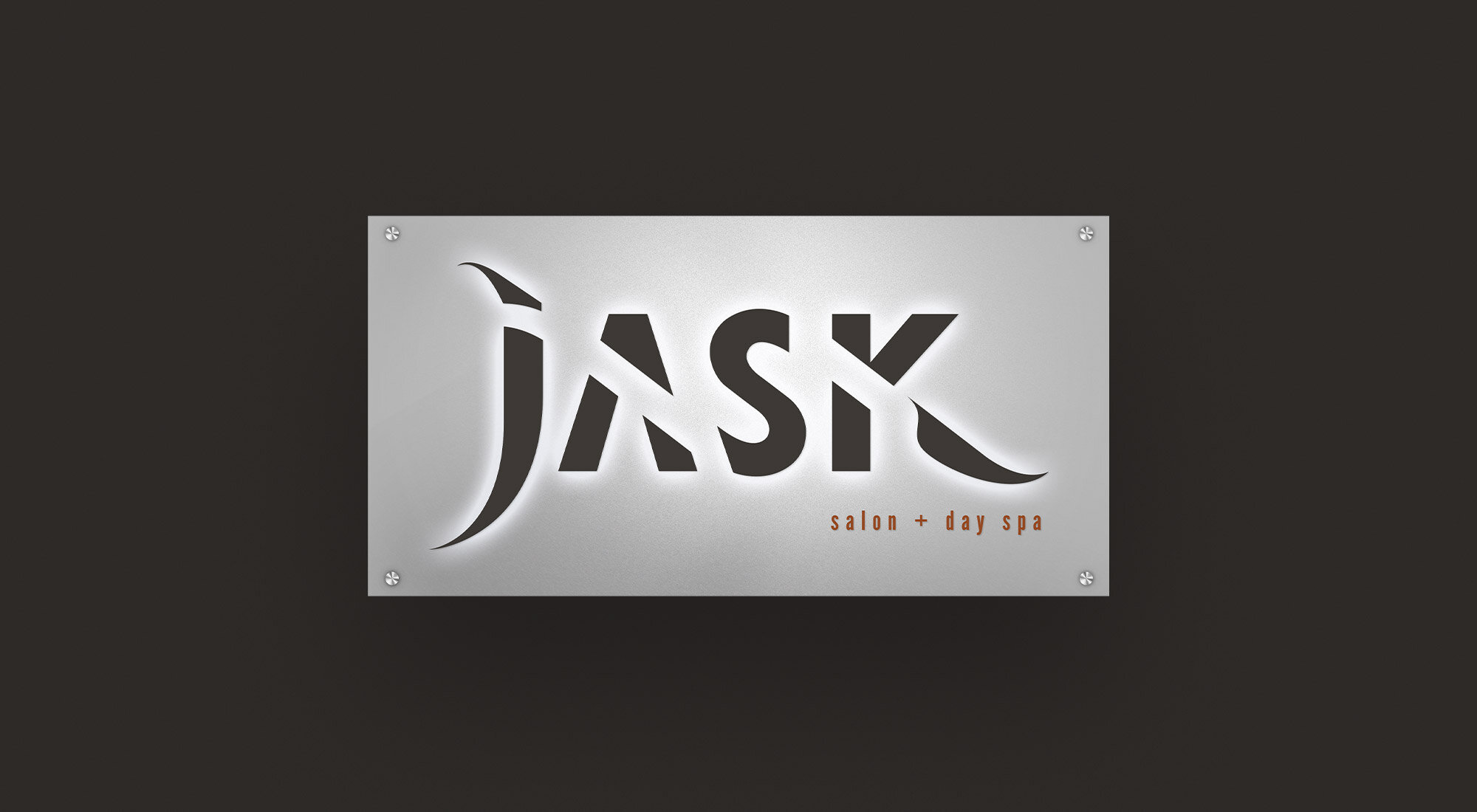
Outdoor Signage
BRANDING + PRINT
OFATV
This fun poster series for the Ontario Federation of ATV clubs developed a strong look and feel that their previous branding lacked. Dirty, split text catches the eye, but maintains legibility. Gritty edges separate content and appropriate track marks provide additional interest to this new, fresh series of collateral.
This project was made while working at Xquisit Communications.

PRINT + Social Media
COMMISSIONAIRES
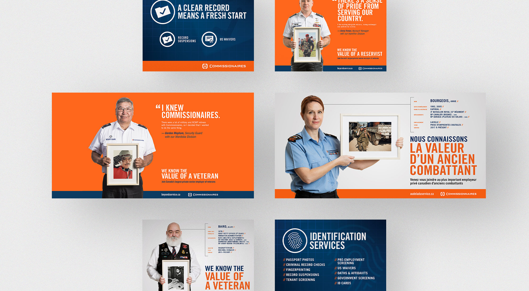
For a couple of years, I was the go-to designer for Commissionaires, a non-profit security firm that strongly believes in the value of a veteran. I’ve produced countless projects, including an annual report, base papers, collateral for their Halifax opening, social media posts, and more. The key to working on a large number of projects for a large corporation is making sure every decision made is consistent with the existing brand, all while evolving the design so it stays fresh and exciting. I’m grateful to have been a part of something bigger and I’m proud of the work I’ve produced for Commissionaires over the years.
This project was made while working at Xquisit Communications.

Halifax office opening posters
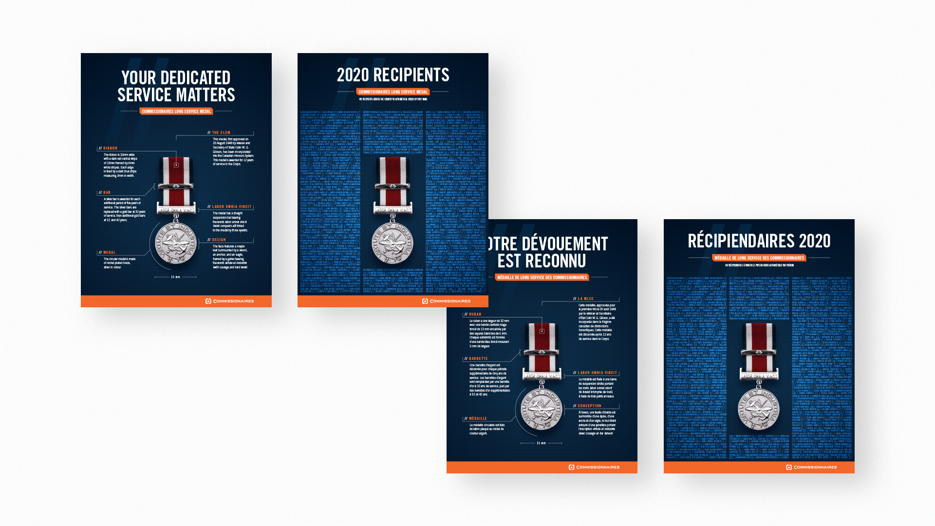
Commissionaires Long Service Medal posters
Social media posts

Annual Meeting of Divisions document
WEB
IMC ANNUAL REPORT 2019
Right from the start, the goal of this Annual Report website was to communicate the progress and strategies of Innovative Medicines Canada in a sleek, and modern fashion. This was achieved by utilizing their primary colour scheme, contemporary type treatment, subtle textures, a dash of parallax, and last but not least, generous amounts of white space.
Each section uses one of IMC's brand colours, and ends with a huge textured block featuring a pull-out quote. This subtle texture placed throughout the site uses shapes from the IMC logo; maintaining a satisfying visual consistency. These textured blocks visually separate the sections from eachother, while also highlighting important information from each section.
Round buttons with a liquid hover animation match the round elements of the logo and textures. Section headers are set at a large size, a quite thin weight, and are overlapped onto photos. Body copy uses generous amounts of leading, keeping everything nice and spaced out, increasing legibility.
Combined, these type treatment solutions are an effective contribution to the modern look of the site.
This project was made while working at Xquisit Communications.

Desktop

Laptop

Iconography
3sixty secure corp
These service icons were created for 3Sixty Secure Corp, an emerging security firm in Canada and the United States. 3Sixty provides their clients with custom security solutions so they can have a peace of mind for their businesses. Naturally, these fun custom icons were a secure solution.
Each and every icon utilizes the 30° and 60° angles of the 3Sixty brand, as well as the sharp edges and colour choices. These icons are simple, to the point, and most importantly, they are uniform with one another. All line weights, colours, and type treatment are all consistent with one another; a key factor for a strong and effective icon set.
This project was made while working at Xquisit Communications.
